Crafting a Quicker COVID Queue? Mapping Ottawa's Age-80+ Residents
Introduction
Could we use publicly available data to help the City of Ottawa focus its COVID-19 vaccination efforts? According to CBC News, the City of Ottawa has announced that it expects to begin vaccinating residents over 80 years old who live on their own in early March. In this post we’ll link census data, geospatial data, and information about health-care facilities to look at where the city’s 80+ population lives, and where might be good places for vaccination clinics.
It should go without saying that this is an unofficial proof-of-concept, and I assume Ottawa Public Health is already looking at this kind of thing more formally. But if you’re not… uh, hit me up.
To answer this question we’ll need to work with StatsCan’s API to grab census data, manipulate geospatial data, do some web scraping and some geocoding, and produce some really lovely maps. So let’s get started!
Getting Ottawa’s Census Data
We work with census data quite a bit at the Ottawa Neighbourhood Study, so I’ve written a few R functions to interact with StatsCan’s lovely APIs. I’ll put some technical notes in code comments (so click “Show Code” if you’re interested), but the short version is that these APIs let us ask StatsCan for specific information quickly and automatically.
StatsCan divides Canada into distinct regions of differing sizes. The smallest region you can get detailed information for is called a “dissemination block,” or “DA,” which usually corresponds to a few city blocks. So for this example we’ll ask StatsCan for the detailed population information for each of Ottawa’s 1372 dissemination areas.
# Here I'm again using the Ottawa Neighbourhood Study (ONS) R package. You
# can find it on GitHub here: https://github.com/Ottawa-Neighbourhood-Study/onsr
# To find all the DAs in Ottawa, first we'll query for all the DAs in Ontario.
# This is an experimental custom function, so it might change!
das_ontario <- onsr::census_get_geographies()
# Then we take the DAs we got and filter to keep only the ones that start with "3506,"
# which corresponds to Ottawa's Census Division.
# Part of the reason we need to use these functions is that you don't send a list of DAs
# to the API. Instead, you send a list of "GEO_UID"s, which are specifically unique identifiers:
# basically the DA plus some other prefixing information. So we just query StatsCan to find them.
das_ottawa <- das_ontario %>%
filter(str_detect(GEO_ID_CODE, "^3506"))
# Here we take the list of DAs we want, extract their GEO_UIDs, and then feed those to StatsCan's
# API and ask for census data. By default the function gets all data, but you can narrow it down.
census_ottawa <- das_ottawa %>%
pull(GEO_UID) %>%
onsr::census_get_data()
# We'll save it to file (>300MB) so we don't have to do this query more than once.
census_ottawa %>%
write_csv("census_ottawa.csv")How many Ottawa residents are aged 80+, and where do they live?
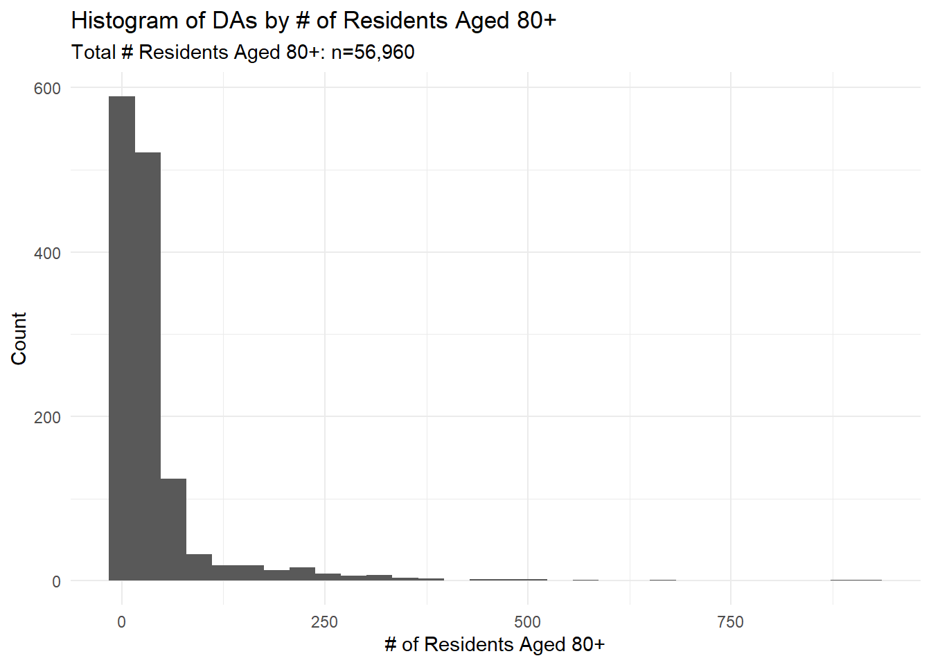
The histogram below shows how Ottawa’s 56,960 age-80+ residents are distributed across its dissemination areas.
da_over_eighty <- census_ottawa %>%
select(TEXT_ID, GEO_ID, T_DATA_DONNEE) %>%
filter(TEXT_ID %in% 2020:2025) %>%
group_by(GEO_ID) %>%
summarise(over_eighty = sum(T_DATA_DONNEE, na.rm = TRUE)) %>%
mutate(GEO_ID = as.character(GEO_ID))
da_over_eighty %>%
ggplot() +
geom_histogram(aes(x = over_eighty)) +
theme_minimal() +
labs(title = "Histogram of DAs by # of Residents Aged 80+",
subtitle = paste0("Total # Residents Aged 80+: n=",(sum(da_over_eighty$over_eighty) %>% format(big.mark=","))),
y = "Count",
x = "# of Residents Aged 80+") 
The distribution has a strong right skew: most DAs have fewer than 100 age-80+ residents, but a few have over 750! This suggests that we might be able to make quick progress by focusing vaccination efforts on those DAs first.
As a next step, we can make an interactive map to see where the DAs are with the highest age-80+ populations.
# Yet another cheat here! I'm loading the StatsCan dissemination area shapefile into a variable called da_shp off-camera.
# You can get it here: https://www12.statcan.gc.ca/census-recensement/2011/geo/bound-limit/bound-limit-2016-eng.cfm
da_over_eighty_shp <- da_shp %>%
filter(DAUID %in% da_over_eighty$GEO_ID) %>%
select(DAUID) %>%
left_join(da_over_eighty, by = c("DAUID" = "GEO_ID")) %>%
sf::st_transform(crs = 32189)labs_ottawa <- paste0("DAUID: ", da_over_eighty_shp$DAUID,
"<br>Population 80+: ", da_over_eighty_shp$over_eighty) %>%
purrr::map(htmltools::HTML)
pal_non_ott <- colorNumeric(palette = "viridis",
domain = da_over_eighty_shp$over_eighty,
reverse = FALSE)
da_over_eighty_shp %>%
sf::st_transform(crs = "WGS84") %>%
leaflet() %>%
addTiles() %>%
addPolygons(fillColor = ~ pal_non_ott(over_eighty),
fillOpacity = 0.7,
weight = 1,
label = labs_ottawa) %>%
addLegend(pal = pal_non_ott,
values = ~ over_eighty,
title = "Pop. Aged 80+")Two bright yellow spots jump out! However, if you squint at the map you’ll notice a trend: many of the lighter spots tend to contain facilities that care for older adults. The bright yellow spot to the east, for example, includes The Ottawa Hospital and at least one retirement home; the yellow spot to the west contains Forest Hill and some other retirement residences; and centrally on Riverside we can see the DA where St. Patrick’s is located.
In other words, this tells us where all age-80+ residents live, including those in long-term care homes and other facilities. But since Ottawa is doing reasonably well at vaccinating people in these facilities, we might want to try to separate them out.
Including Retirement & LTC Homes
The next step is to find all long-term care (LTC) homes and retirement homes in Ottawa, get their addresses, convert them to latitude and longitude, and then match those lat/lon coordinates to dissemination areas. It sounds like a lot!
Fortunately Champlain Healthline keeps a list of all long-term care homes and retirement residences in the region, and R is awesome. So we can grab the data, geocode it, and bring it into our analysis with a few lines of code.1
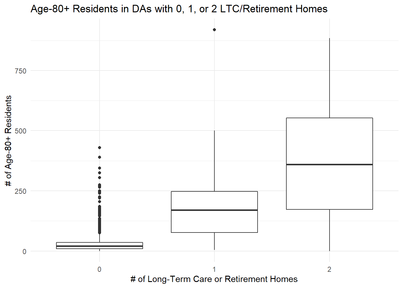
To get a feel for the data, we can make three box plots that show the distributions of age-80+ residents in DAs with 0, 1, or 2 LTC/retirement homes.
# I cheated here too: I loaded the LTC & retirement homes from disk and stored them in ltc_rh.
# get the number of ltc/rhs in each DA and add it to our shapefile
da_non_shp <- sf::st_join(ltc_rh, da_over_eighty_shp, left = FALSE) %>%
sf::st_set_geometry(NULL) %>%
group_by(DAUID) %>%
summarise(num_ltcrh = n()) %>%
right_join(da_over_eighty_shp) %>%
mutate(num_ltcrh = if_else(is.na(num_ltcrh), 0L, num_ltcrh)) %>%
st_as_sf()
da_non_shp %>%
mutate(num_ltcrh = factor(num_ltcrh)) %>%
ggplot() +
geom_boxplot(aes(y=over_eighty, x = num_ltcrh)) +
theme_minimal() +
labs(title = "Age-80+ Residents in DAs with 0, 1, or 2 LTC/Retirement Homes",
x = "# of Long-Term Care or Retirement Homes",
y = "# of Age-80+ Residents")
We can see a clear upward trend: as the number of facilities increases, the number of age-80+ residents tends to increase too. At the same time, there are quite a few DAs with no facilities that still have hundreds of age-80+ residents. Some of those are likely due to facilities that weren’t on the Champlain Healthline website, but for now we’ll assume these numbers are right.
So where might we focus?
My working hypothesis is that all age-80+ residents in DAs with zero LTC/retirement homes live “on their own,” because by definition there are no group settings in their DAs that they could live in. For our purposes here I’ll also make the shakier assumption that many (perhaps most) of the age-80+ residents in DAs with 1 or 2 facilities live in those facilities and so have received the COVID-19 vaccine. If we were actually making a roll-out plan we’d want to do a lot more checking here.
But if we make these assumptions for the sake of argument, we could imagine prioritizing something like this:
- We should prioritize DAs without any LTC or retirement homes, since we expect most age-80+ residents living there live on their own.
- Within these DAs, we could divide them into three tranches based on population density:
- Those with very high populations of over 200 people;
- Those with high populations of over 100 people; and,
- Those with populations of under 100 people.
- After these, we might then prioritize DAs with 1 facility, and finally DAs with 2 facilities.
If we were to do this, the map would look something like this:
da_priority <- da_non_shp %>%
mutate(priority = case_when(
num_ltcrh == 0 & over_eighty > 200 ~ "A1",
num_ltcrh == 0 & over_eighty > 100 ~ "A2",
num_ltcrh == 0 & over_eighty <=100 ~ "A3",
num_ltcrh == 1 ~ "B",
num_ltcrh == 2 ~ "C"
),
priority = factor(priority, levels = c("A1","A2","A3","B","C")))
labs_priority <- paste0("DAUID: ", da_priority$DAUID,
"<br>Population 80+: ", da_priority$over_eighty,
"<br># LTC/Retr. Homes: ", da_priority$num_ltcrh,
"<br>Priority: ", da_priority$priority) %>%
purrr::map(htmltools::HTML)
pal_priority <- colorFactor(palette = "viridis",
domain = da_priority$priority,
reverse = TRUE)
da_priority %>%
sf::st_transform(crs = "WGS84") %>%
leaflet() %>%
addTiles() %>%
addPolygons(fillColor = ~ pal_priority(priority),
fillOpacity = 0.7,
weight = 1,
label = labs_priority) %>%
addLegend(pal = pal_priority,
values = ~ priority,
title = "Priority")To be very clear!!
I’m not proposing this as a bullet-proof plan; this is just a sketch of what’s possible using only publicly available data and open-source tools. I’m also aware that vaccine prioritization is a very touchy subject! So another way of interpreting this is that it shows where you might want to focus your communications, ground game, and maybe even the physical vaccination efforts themselves to reach as many age-80+ people as possible as quickly as possible.
Limitations
This was a quick study done by a non-epidemiologist who has no particular experience in working with older adults, so it has a lot of limitations:
- The data is old. This census data is from 2016, so the population numbers are definitely out of date.
- The LTC and retirement home listings are incomplete. I just pulled the data from Champlain Healthline without doing any validation; there are definitely some institutions missing, and others may have moved or closed.
- We don’t know for sure who lives alone. I’ve assumed that we should prioritize high-population DAs without institutions. But you could imagine that some DAs might just be really age-friendly communities that have both people living alone and in facilities.
- We haven’t included any other relevant data. The census gives us all kinds of data about socio-economics and demographics, and we might be able to include some to help us focus even more.
- And most importantly: I don’t know what I don’t know! Any serious planning study would need subject-matter experts to make sure that the analysis and its assumptions make sense.
And yet…
I do think that this kind of analysis could be one useful input into the fraught decisions that need to be made about wicked problem of vaccine distribution. Even outside of the COVID-19 context, this kind of geostatistical analysis has many applications. It could help policy-makers: since older people often have different health and social needs, this kind of study could help to plan health or social services or pedestrian-friendly walking infrastructure. It could help marketers, too: geomarketing is a real thing, and you could imagine allocating ads, storefronts, or salespeople based on demographics.
But have I missed something crucial? Let me know!
I cheated here and didn’t include screenscraping and geocoding code, because I’ve already got the data on hand from another project. But you could easily scrape it yourself using the methods I outlined here and then geocode it using the techniques I talked about here.↩︎